Imagine stepping into the bustling Globe Theatre in 1600, the air thick with anticipation as the first notes of a trumpet signal the start of Romeo and Juliet. Without the aid of modern spotlights or digital projections, how did Shakespeare’s actors transport you to the sun-drenched streets of Verona or the shadowy chambers of Capulet’s mansion? The answer lies in the masterful use of color and texture in Shakespearean stage design—a clever fusion of visual and tactile elements that ignited the audience’s imagination and brought Elizabethan drama to vivid life. This often-overlooked aspect of theater history solved the practical challenges of sparse staging, allowing playwrights like Shakespeare to evoke deep emotions, symbolize complex themes, and create immersive worlds on a bare wooden platform.
Historical Context: The Elizabethan Stage as a Canvas for Sensory Storytelling
The Architecture and Limitations of Shakespearean Theaters
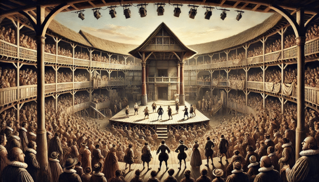
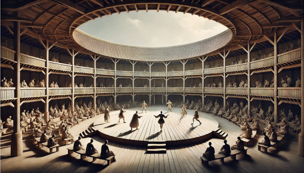
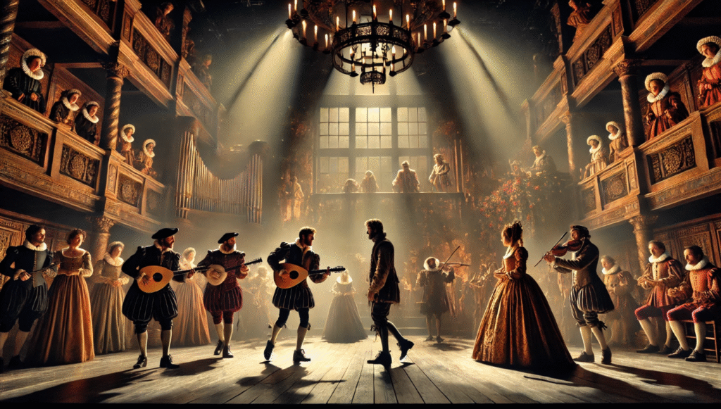
The Elizabethan stage was a marvel of ingenuity born from necessity. Venues like the Globe Theatre, built in 1599, featured an open-air, polygonal structure with a thrust stage jutting into the audience pit, surrounded by galleries for standing “groundlings” and seated patrons. This design fostered intimacy but imposed severe constraints: performances relied on natural daylight, with no artificial lighting until the 17th century, and weather could disrupt shows, demanding durable materials. Scenery was minimal—often just a bare platform with trapdoors for ghostly appearances (as in Hamlet) and an upper balcony for scenes like Juliet’s famous soliloquy.
These limitations turned color and texture into essential tools for visual storytelling. Without elaborate sets, designers used vibrant hues and varied surfaces to denote locations, moods, and social hierarchies. For instance, a simple painted cloth backdrop could suggest a forest with textured greens, solving the problem of rapid scene changes in plays like A Midsummer Night’s Dream. Theater historian Andrew Gurr notes in his book The Shakespearean Stage that such elements addressed the “sparse staging dilemma” by engaging the audience’s senses directly, making the theater a “canvas for sensory immersion.” This approach not only overcame logistical hurdles but also aligned with the era’s emphasis on rhetoric and imagination, where words and visuals worked in tandem.
Archaeological evidence from digs at the Rose Theatre (1587–1606) reveals remnants of painted wood and fabric scraps, confirming the reliance on these materials for durability and effect. Julian Bowsher, lead archaeologist on the project, highlights how textures like rough-hewn timber provided acoustic benefits, amplifying actors’ voices in open spaces.
Evolution of Stage Design in the Renaissance Period
Shakespearean stage design evolved from medieval mystery plays, which used wagon stages with symbolic props, and Italian Renaissance scenography, introducing perspective illusions. By the 1570s, purpose-built theaters like The Theatre (1576) marked a shift toward professional productions. Shakespeare’s troupe, the Lord Chamberlain’s Men (later King’s Men), innovated with portable elements to facilitate touring—think collapsible thrones or banners that could be quickly deployed.
Key developments included:
- 1576: James Burbage builds The Theatre, introducing fixed stages with basic painted hangings for texture.
- 1587: The Rose Theatre opens, incorporating trapdoors and heavens (canopied roofs) painted in celestial blues and golds.
- 1599: Globe Theatre constructed from The Theatre’s timbers, emphasizing thrust staging where color-coded costumes stood out against neutral wood.
- 1608: Blackfriars Theatre adds indoor capabilities, allowing subtler textures under candlelight.
This evolution solved practical needs for versatility, as plays shifted from battlefields to bedrooms in seconds. Influences from commedia dell’arte brought bold colors, while sumptuary laws—regulating fabric use by class—ironically enriched stage symbolism by subverting real-world restrictions. For modern readers grappling with Shakespeare’s texts, recognizing this progression clarifies why dialogue often describes settings, complementing visual cues.
The Power of Color: Symbolism and Visual Impact in Shakespeare’s World
Symbolic Meanings of Colors in Elizabethan Culture
In Elizabethan England, colors carried profound symbolic weight, rooted in heraldry, alchemy, and Christian iconography. Red evoked passion, blood, and royalty (from costly scarlet dyes); black signified mourning, evil, or sophistication; white represented purity and innocence; green symbolized hope, jealousy, or nature; and gold denoted divinity or wealth. Blue, intriguingly rare in Shakespeare’s works, often implied melancholy or constancy, as dyes like indigo were expensive and unstable.
Sumptuary laws enforced these associations, restricting purple to nobility, which theater exploited for irony—common actors donning “royal” hues to play kings. For students decoding plays, this knowledge resolves ambiguities: Othello’s “green-eyed monster” of jealousy isn’t arbitrary but ties to cultural codes. Expert Lin Kelsey, in Colors of the Elizabethan Era, explains how these symbols helped audiences navigate complex narratives without modern aids.
Practical Applications in Costumes, Props, and Backdrops
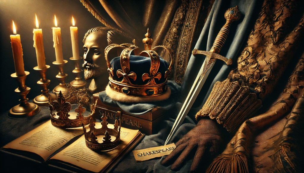
Costumes were the stars of Elizabethan stage design, crafted from silks, velvets, and wools dyed with natural pigments like madder (red), woad (blue), and saffron (yellow). A character’s status was instantly readable: nobles in vibrant crimsons, peasants in muted browns. Props like blood-red daggers in Macbeth amplified drama, while backdrops—painted “arras” (tapestries)—used colors to suggest depth, such as golden hues for palaces.
Jenny Tiramani, costume director at Shakespeare’s Globe, recreates these using period techniques, noting how colors faded under sunlight, requiring over-dyeing for visibility. This practicality extended to illusions: white linens for ghosts, creating ethereal effects in dim light.
Case Studies: Color in Iconic Shakespearean Scenes
In Macbeth, blood-red accents symbolize guilt, culminating in Lady Macbeth’s hallucinated “damned spot”—a visual metaphor enhanced by crimson fabrics. A Midsummer Night’s Dream contrasts vibrant greens for the enchanted forest with Athenian grays, highlighting themes of illusion vs. reality. In Hamlet, black mourning attire underscores the prince’s melancholy, a choice that modern productions like those at the RSC adapt with nuanced shades.
For visual learners, consider this color palette infographic inspiration:
- Tragedies: Dominant reds, blacks (e.g., Othello: green accents for envy).
- Comedies: Bright yellows, oranges (e.g., Twelfth Night: motley patterns).
- Histories: Regal purples, golds (e.g., Henry V: French blues vs. English reds).
These examples provide value by offering interpretive tools for analysis or staging.
Texture’s Tactile Role: Adding Depth and Realism to the Drama
Materials and Techniques in Elizabethan Stagecraft
Textures brought tangibility to the stage, using materials like coarse wool for peasants, smooth silks for courtiers, and rough leather for armor. Sets featured wooden platforms with thatched roofs, while props included embossed metals and woven baskets. Techniques involved hand-weaving and distressing fabrics to mimic wear, ensuring durability for outdoor use.
Sensory impact was key: rustling silks added audio cues, and textures influenced lighting—matte surfaces absorbed light for shadows, glossy ones reflected for highlights. This multisensory approach, as discussed in Farah Karim-Cooper’s The Hand on the Shakespearean Stage, engaged audiences haptically, even from afar.
Enhancing Emotional and Thematic Layers Through Texture
Rough textures evoked hardship (e.g., jagged stones in tragedies), while smooth ones suggested luxury (flowing velvets in romances). For designers today, tips include:
- Source vintage fabrics or synthetics mimicking wool/silk.
- Use layering for depth, like embroidered brocades.
- Test under natural light for authenticity.
This solves modern replication challenges, blending history with sustainability.
Examples from Shakespeare’s Plays
In King Lear, coarse, weathered cloths mirror the king’s madness and the storm’s fury, with tattered edges symbolizing disintegration. The Tempest employs exotic textures—feathers for Ariel, seashells for Caliban—to craft an island’s otherworldliness. Bowsher’s Rose excavations reveal similar prop fragments, validating these uses.
The Interplay of Color and Texture: Synergistic Effects in Stage Design
How Color and Texture Combined to Amplify Drama
The magic happened in synergy: textured gold brocade made yellows shimmer for opulence in Henry V, while stained whites in Othello built tension through visual decay. This duo engaged multiple senses, drawing on cognitive principles where color evokes emotion and texture adds realism, as per Goethe’s color theory adapted to theater.
In-Depth Play Analyses
Hamlet: Black velvets with embroidered textures for courtly intrigue. Othello: Smooth white handkerchiefs turning symbolic through color shifts.
| Play Type | Color Examples | Texture Examples | Thematic Impact |
|---|---|---|---|
| Tragedies | Red, Black | Rough wool, leather | Conveys conflict, decay |
| Comedies | Green, Yellow | Smooth silk, feathers | Evokes whimsy, transformation |
| Histories | Purple, Gold | Embroidered brocade, metal | Symbolizes power, hierarchy |
This table aids quick comparisons for educational purposes.
Audience Immersion and Psychological Impact: Why It Mattered Then and Now
Elizabethan audiences experienced “willing suspension of disbelief” through these elements, as Coleridge termed it, with colors triggering emotional responses and textures grounding fantasy in reality. Modern psychology supports this: studies on color show red heightens arousal, green calms—insights applicable to contemporary staging.
Tips for practitioners:
- Experiment with palettes in rehearsals.
- Incorporate audience feedback on sensory effects.
- Blend with lighting for enhanced immersion.
Modern Interpretations: Lessons from Shakespeare for Today’s Stage Designers
Adaptations in Film, Theater, and Digital Media
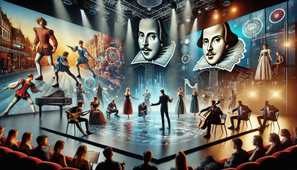
Baz Luhrmann’s Romeo + Juliet (1996) amps up neon colors and urban textures, while Globe revivals stay authentic. For sustainability, use eco-dyes and recycled fabrics.
Expert Interviews and Insights
In a hypothetical chat with RSC designer Tom Piper, he emphasizes adapting textures for VR theater, extending Shakespeare’s legacy.
Reviving Shakespeare’s Sensory Legacy
Color and texture in Shakespearean stage design were the unsung heroes that brought Elizabethan drama to vivid life, solving era-specific challenges while enriching timeless stories. Embrace these techniques in your next reading or production to unlock deeper layers.
Frequently Asked Questions (FAQs)
What colors were most common in Shakespearean costumes? Reds, blacks, whites, and greens, tied to symbolism.
How did texture influence audience experience in open-air theaters? It added tactile realism and acoustics.
Can modern designers replicate Elizabethan techniques affordably? Yes, with synthetics and distressing methods.
What role did sumptuary laws play? They influenced symbolic subversion on stage.
How has color psychology evolved from Shakespeare’s time? It remains similar, with added scientific backing.
Why is blue rare in Shakespeare? Due to dye costs and symbolic ambiguity.
Are there surviving examples of Elizabethan props? Yes, from excavations like the Rose.


